Framing and Cropping Photographs
What makes a photograph interesting? Well, a lot of variables: lighting, dynamic range, contrast, color saturation (or the lack thereof), tone, special effects (such as vignetting), grain or texture, and (of course) the subject matter of the photo itself.
But if all of these things are equal, what about the way the subject is framed? Should the subject demand center stage? Or is the photograph more compelling when the primary subject is offset? How tightly should the subject be framed? Should you use some element in the image itself to frame or focus attention on the primary subject?
Experimenting with One Image
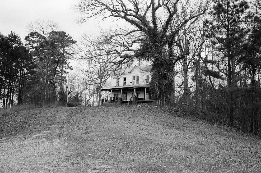
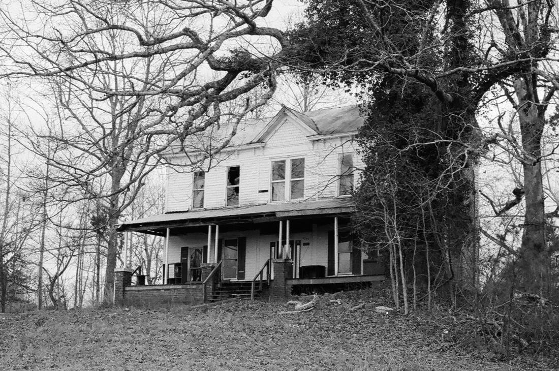
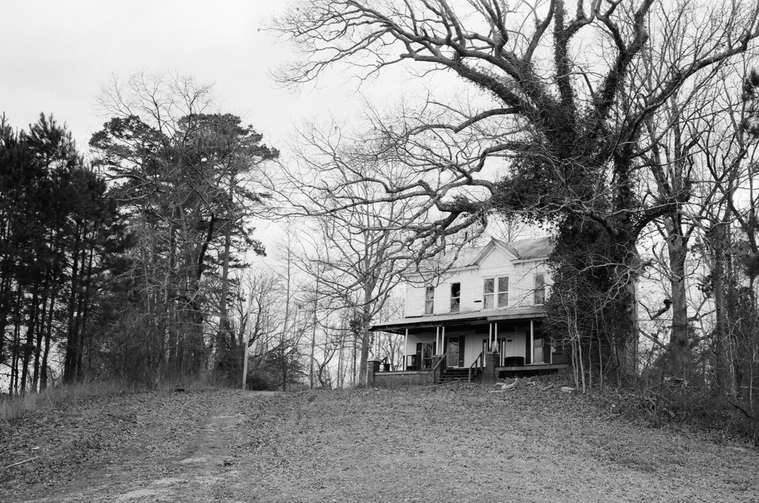
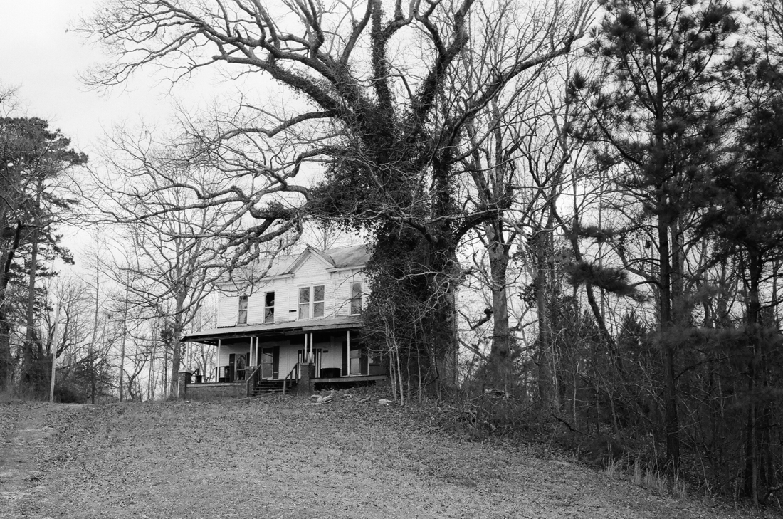
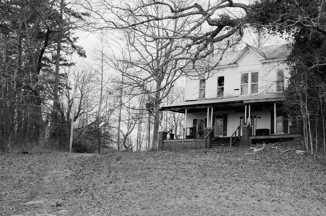
I thought it might be interesting to gather your opinions on the subject of framing and cropping a photograph and picked one that I'd recently featured on the "latest light" page. That image is one that I posted "as is" with regard to framing. In other words, it's the image as I shot it, with only slightly increased contrast and just a suggestion of vignetting. But what if the photo was cropped or framed in another manner?
This is the original image - un-cropped and framed by the constraints of the 28mm lens and the 35mm film
To Compose or Not
If you do an internet search on "composition in photography" of something similar, you'll quickly come across the "rule of thirds" and its advocates and detractors. I'm not going to give you choices that strictly adhere to any particular rule or school of thought on composition. I'm just going to play around with cropping and framing this image in a few different ways to get your reaction. So, don't think about it too much - just give me your quick impression. You can vote on your choice in the comments below or on Facebook, where I'll post a link to this blog.
I'd Like Your Opinion
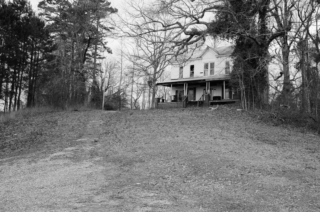
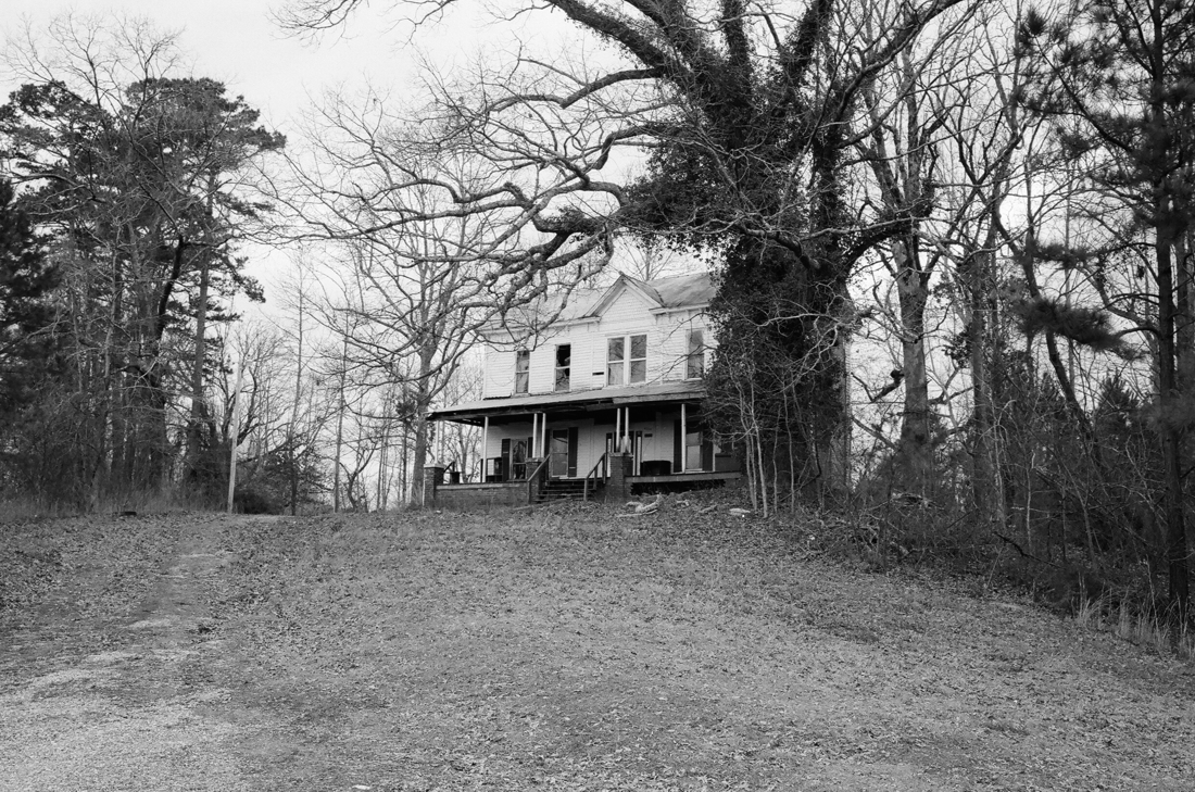
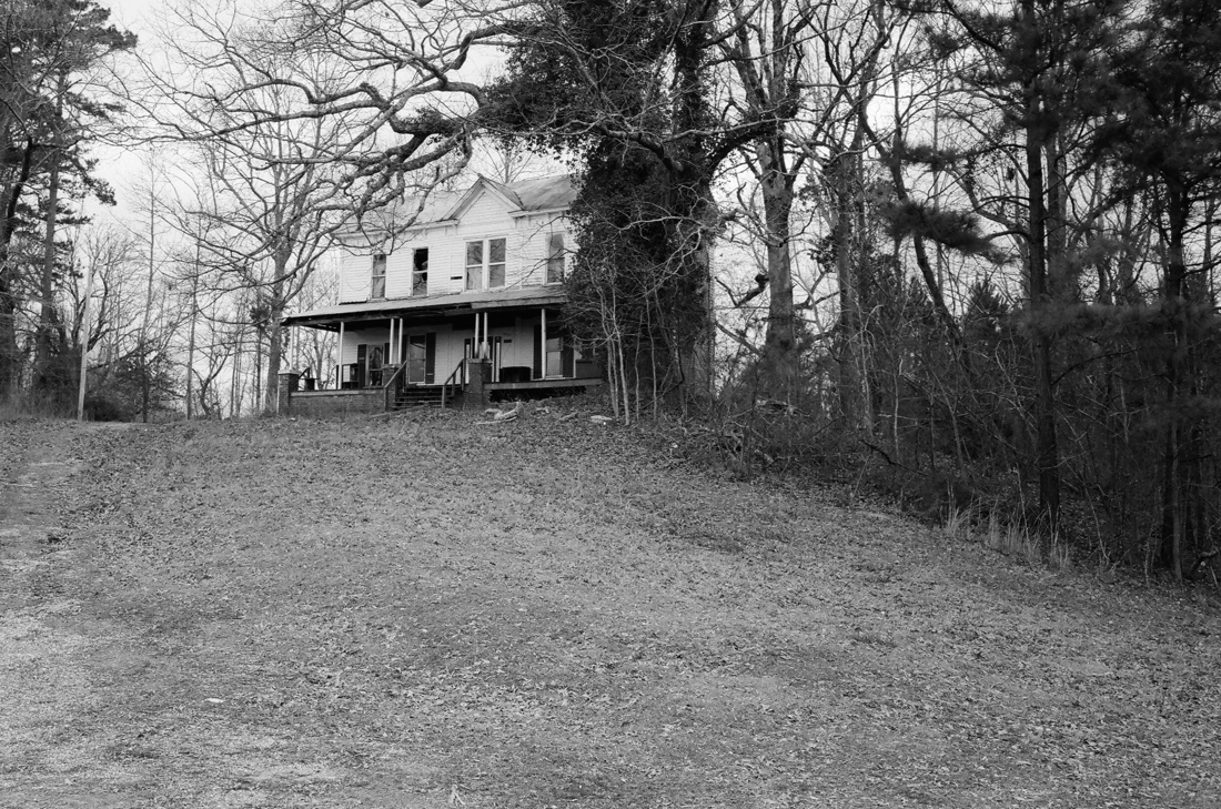
I've posted the original and seven alternatives below. Let me know which one you find to be the most compelling, interesting, etc. You can give the reasons for your choice, or just list your choice. Thanks!
